↗ Task
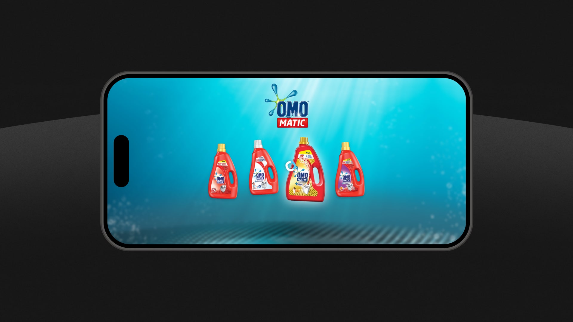
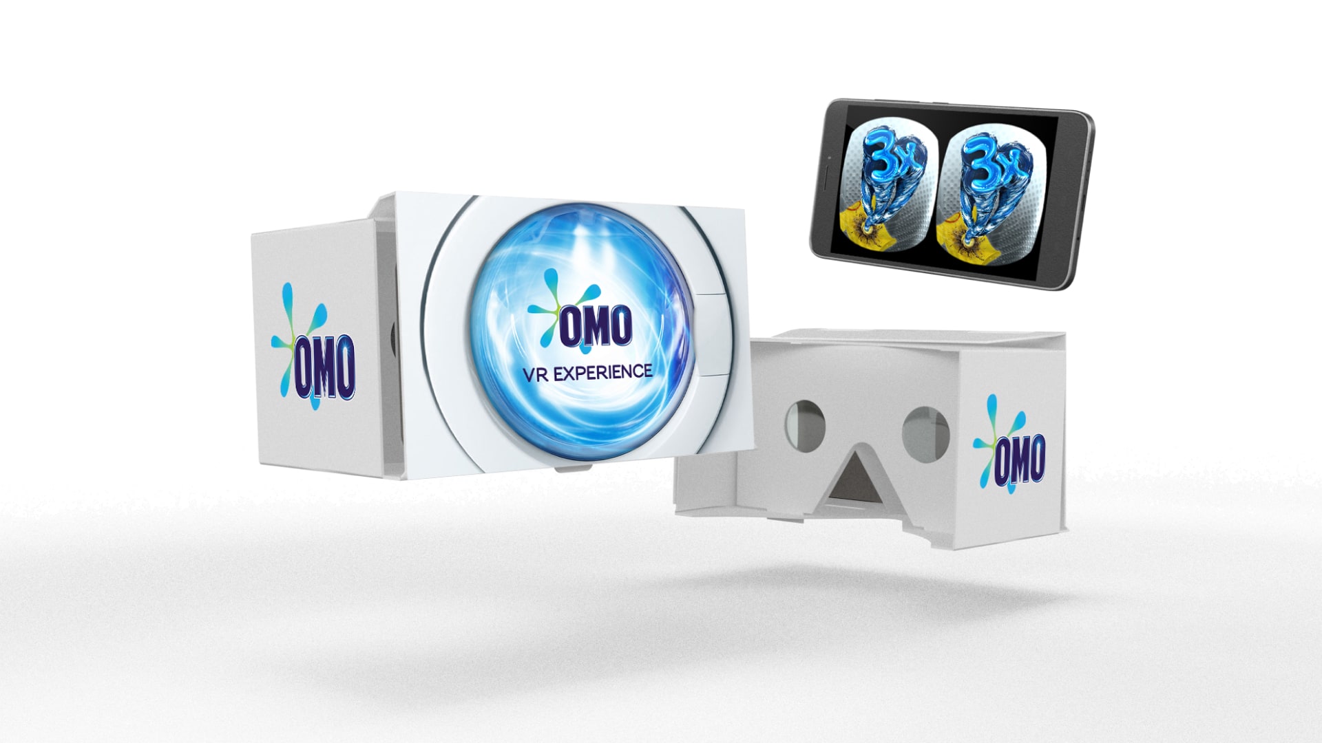
Unilever wanted to try a new advertising channel for the campaign of a new product. The task was to make the power of the detergent as visually exciting as possible, and to highlight the differences between it and the 4 varieties. It was important that the VR experience could be easily shared and no download from the app store was required.
↗ Planning
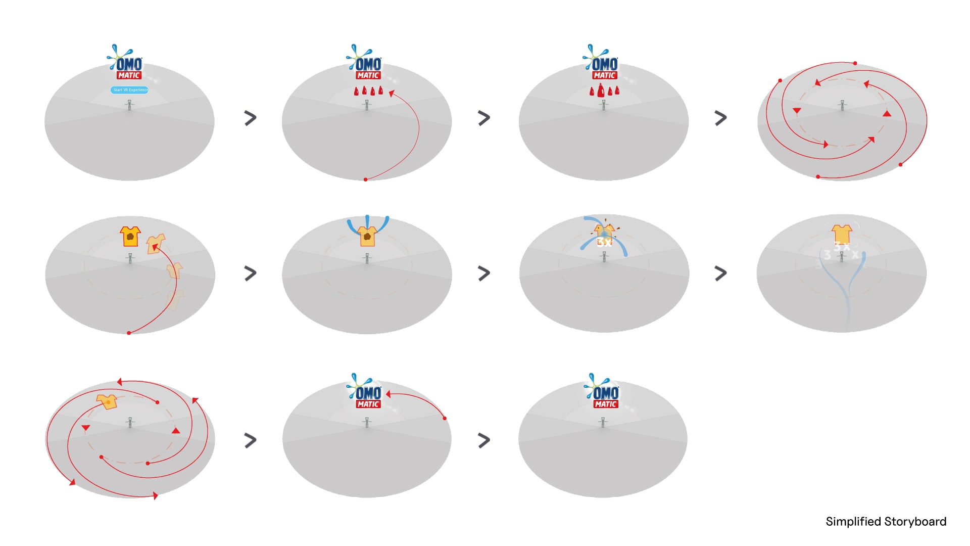
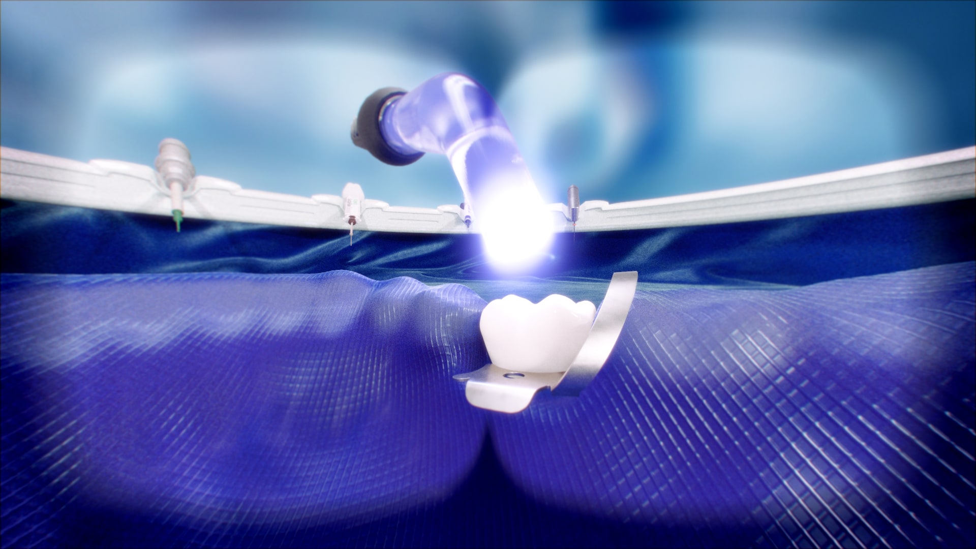
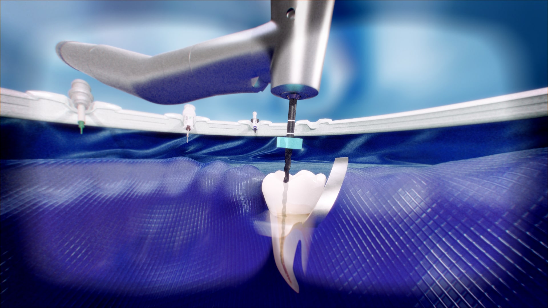
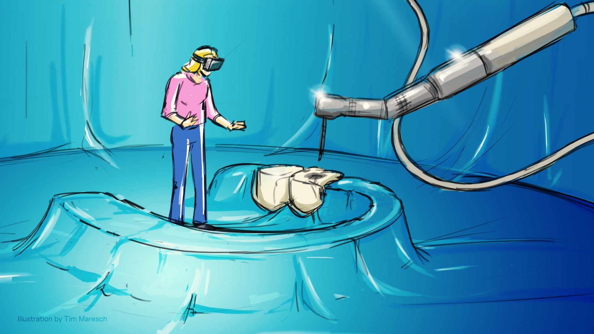
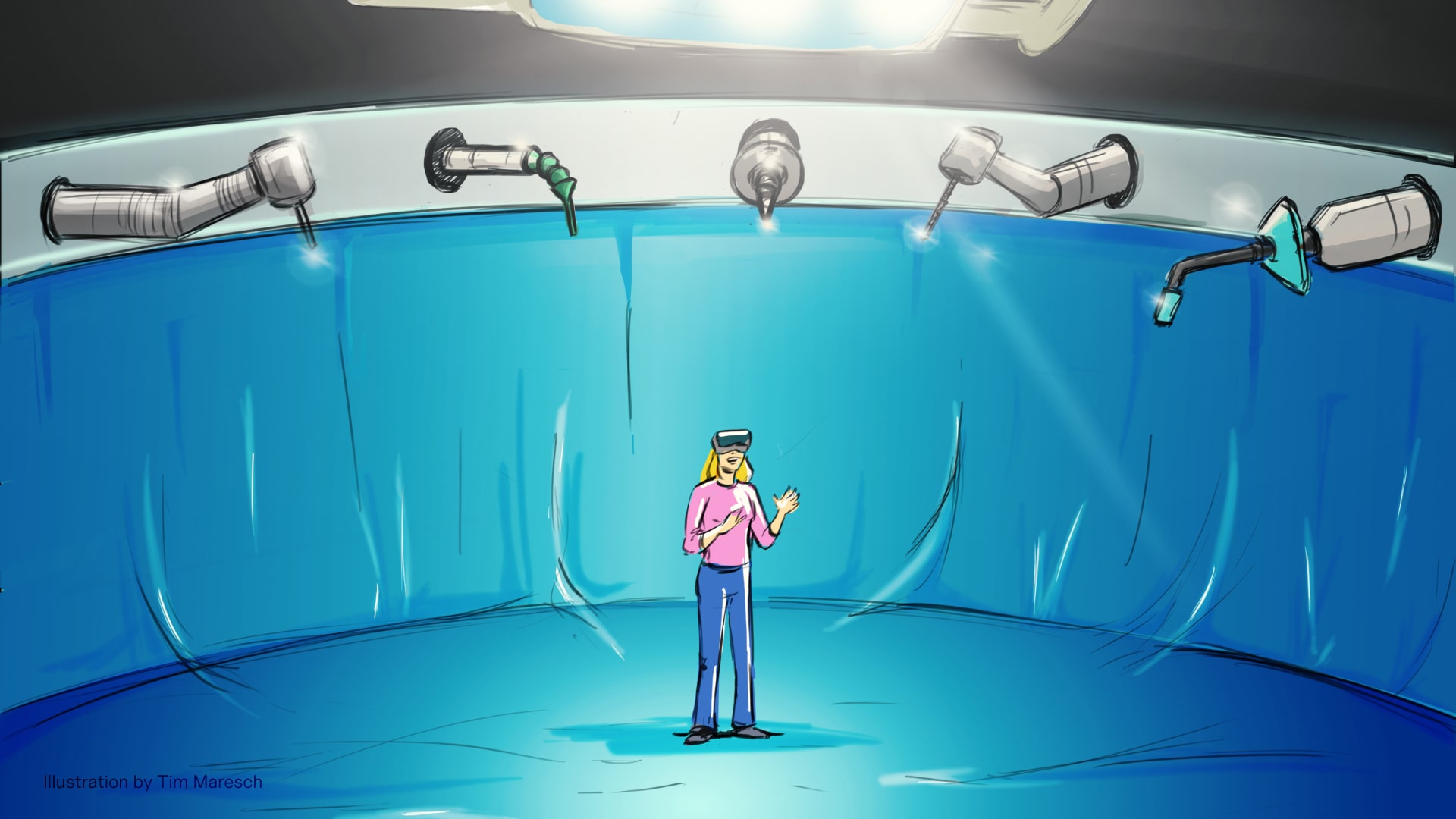
During ideation, we agreed to teleport the user into a simplified, digital washing machine. After finalizing the scribbles, we went to work on the storyboard and presented the ideas both internally and to the client. Once all the technical details were sorted out, we started producing the required data. This of course included 3D, sound design and programming in addition to the user interface.
↗ Journey
The viewer must initially open the website in which the VR experience is embedded. First, he is asked whether he has suitable glasses for this. Depending on the selection, either a stereoscopic view or a 360° video is called up, which can also be viewed without glasses. The viewer selects one of the varieties by moving their head slightly, thus playing one of the 4 versions of the experience. After the presentation is finished, the selection of bottles reappears.
↗ Learnings
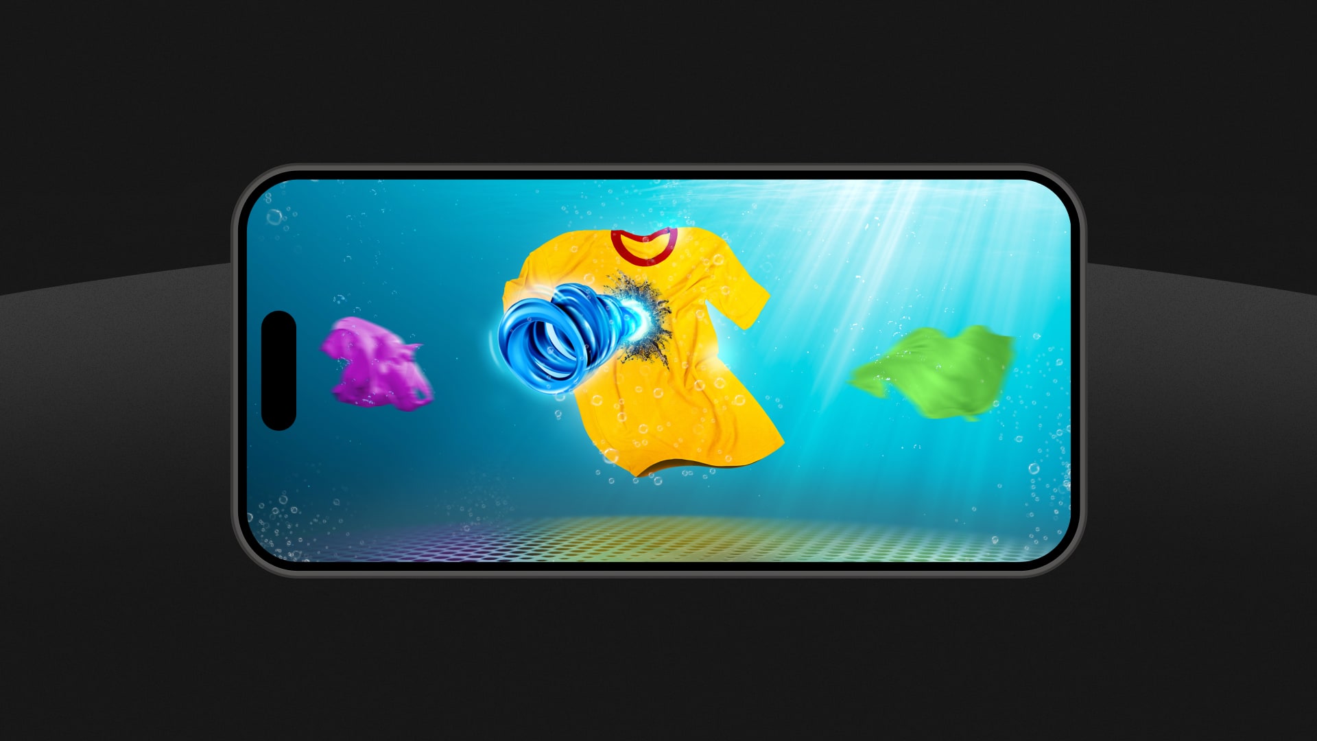
In order to direct the user’s focus toward the cleaned garment, it was crucial to make the object as visually striking as possible. To achieve this, we positioned the garments that were only contributing to the atmosphere into the background by reducing color saturation, among other techniques. Additionally, it was essential to create spatial sound design that complemented the visual effects. This approach enabled us to offer the viewer an incredibly immersive experience.
↗ Contribution
Concept, Storyboard, Art Direction, UX, UI
↗ Year
2017
↗ Company
svarmony