↗ Task
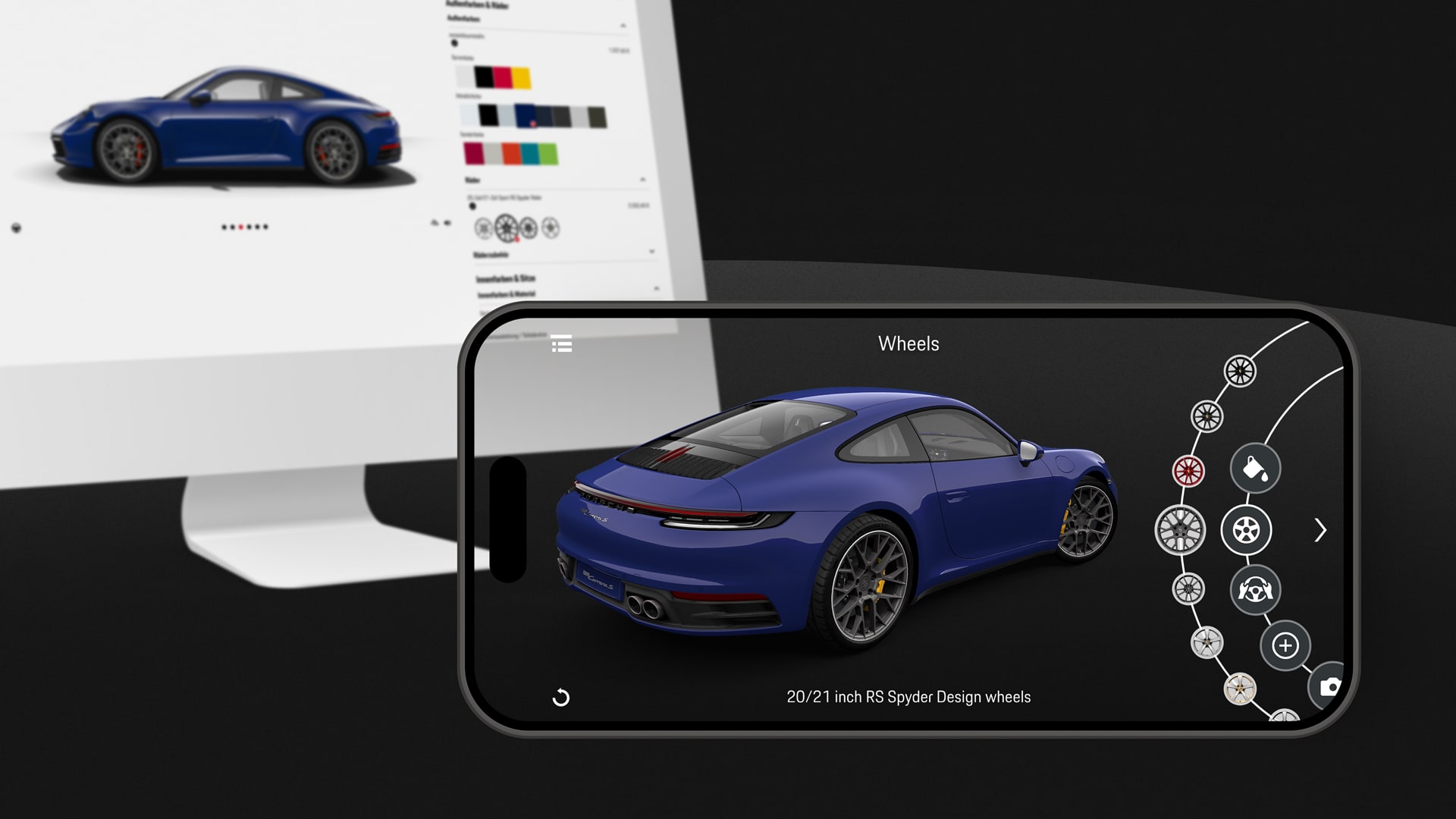
Porsche and our team were thinking about how we could enhance the customer journey for potential customers. With the goal of creating a more immersive experience, we came up with the idea of using augmented reality to enhance the online configurator and integrate it into the existing customer journey. Customers should first use the configurator on the website to design their dream car. With the help of the “Porsche Code,” which stores the configuration details, they would be redirected to the app. There, they could view the car from different angles on any surface and make further adjustments if necessary.
↗ Planning
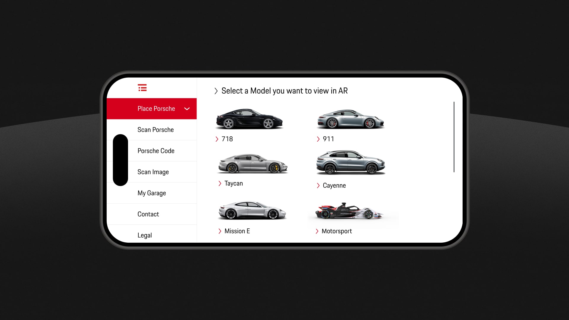
As you can imagine, there are countless configuration options that need to reflect the look and feel of the car. To avoid technical details, I’d like to focus on the user experience and usability decisions in this description: We first analyzed various personas provided to us by Porsche. In the process, we noticed that there are large age differences among customers depending on their country of origin. Since the app was released internationally, we had to take into account that both tech-savvy 25-year-olds and 50-year-olds would use the app. We also assumed that many users would not enter the app directly from the web configurator, but would want to test the app directly after downloading it. Therefore, entering the Porsche code did not have a high priority in the hierarchy. Other functionalities such as “Scan Porsche” and “My Garage” also had to be integrated. We took the logic for displaying the different models and derivatives from Porsche’s website and design system.
↗ Journey
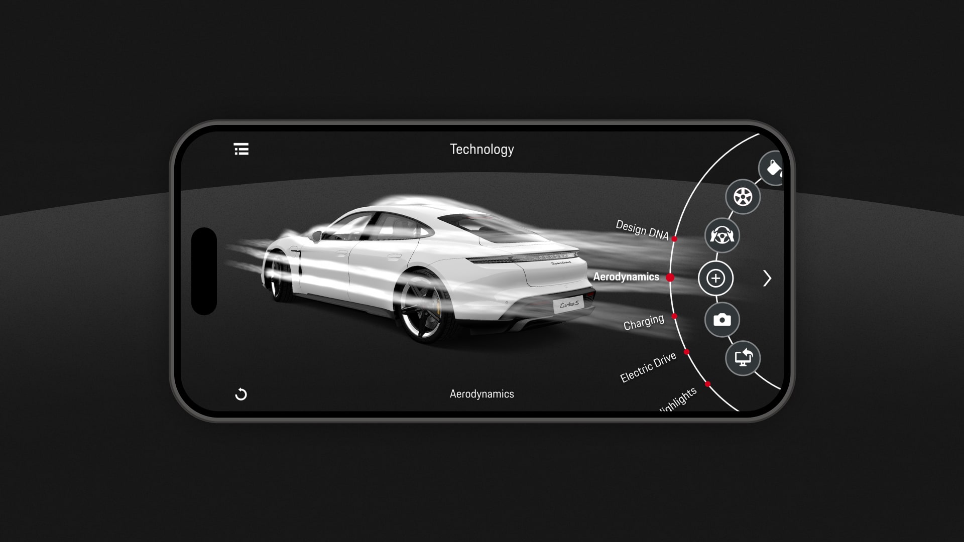
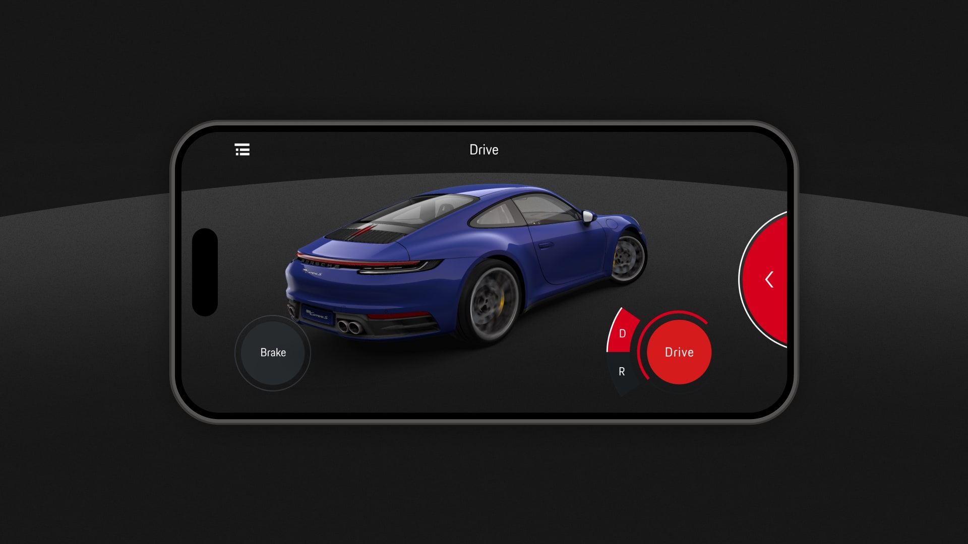
After approving various permissions, which are crucial for AR functionality, the user is directed to select a model. Since the models are customizable and contain large amounts of data, they must be downloaded manually. Once downloaded, the camera is activated and the user is guided through the placement process by various animations. After successful placement, the radial menu opens on the right side. This menu includes two levels and offers configurations and functions such as color selection, rim selection, technical animations, screenshots and more. The last menu item redirects the user to the online configurator, where he can make further adjustments and buy the car.
↗ Learnings
Analyzing different personas helped us understand a broad target group. To help bridge the waiting time during the download, we embedded “Fun Facts” for each specific model. Animations that illustrated the motion pattern of scanning a surface helped users complete the placement process faster and with less friction. The decision to use landscape mode was based on the optimal display of cars. This also allowed the device to be stable in the hands, and all elements on the 2D plane could be comfortably operated with the thumbs. The radial design allowed users to navigate the configuration menu with light swiping motions of the thumb. Many other insights into handling cars, especially the Porsche brand, came from the award-winning “Mission E” apps which we had previously developed.
↗ Awards
IF Design: Communication
↗ My Contribution
Concept, UX, UI
↗ Year
2019
↗ Company
svarmony
↗ Download
App Store
Google Play Store