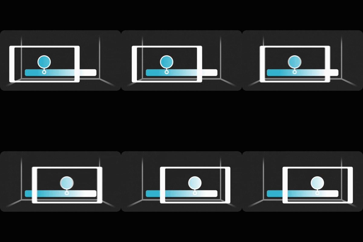
Color
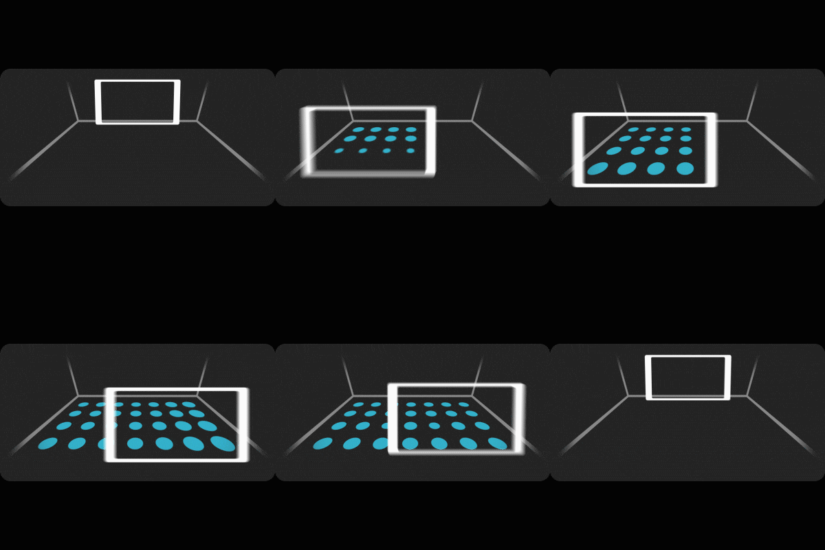
Scan
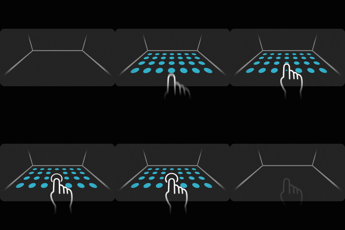
Place
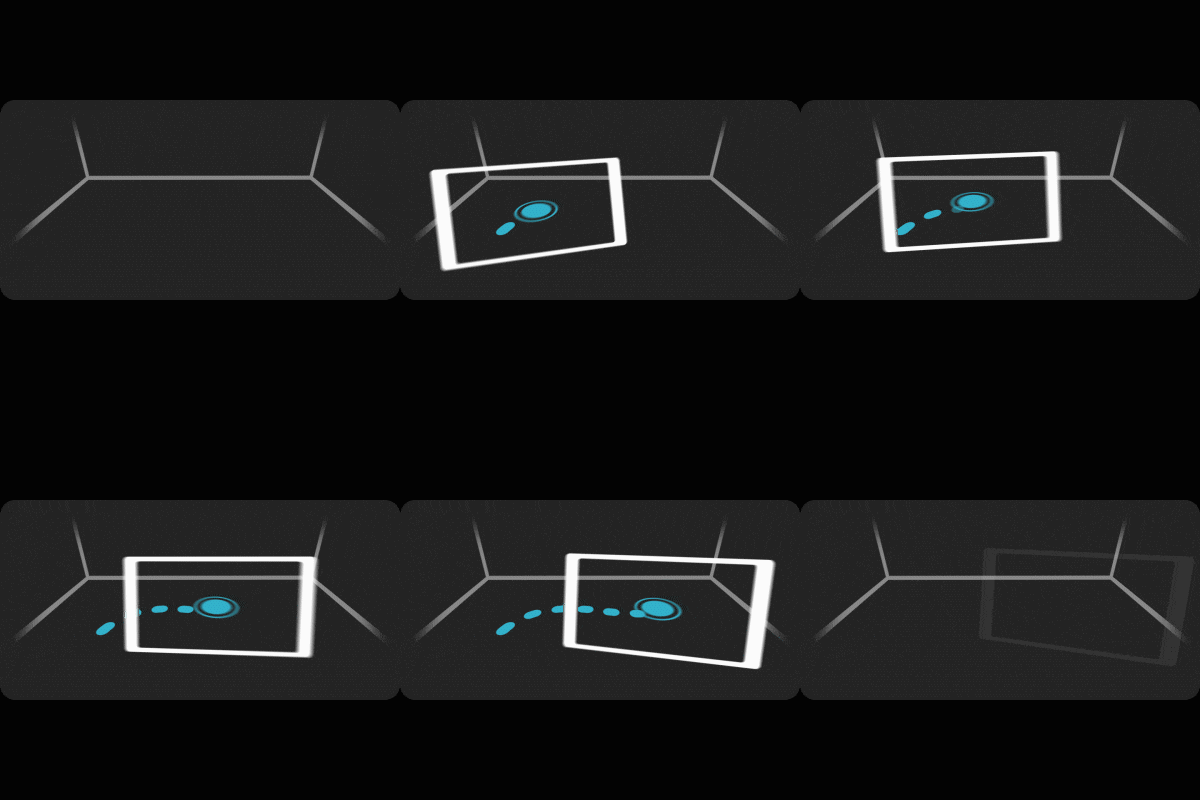
Drive
↗ Task
For a series of events, Porsche wanted to enhance the presentation of the “Mission E” concept car with an interactive experience. This required using the real car, or a miniature, as a reference to scan and overlay. The main task was to make hidden and special features visible using AR. Today, a commercial version of this car is sold as Porsche Taycan. After the successful tour, we had the task to develop a publicly accessible version without a physical model. The public version also had to include more features that would greatly change the user journey.
↗ Planning
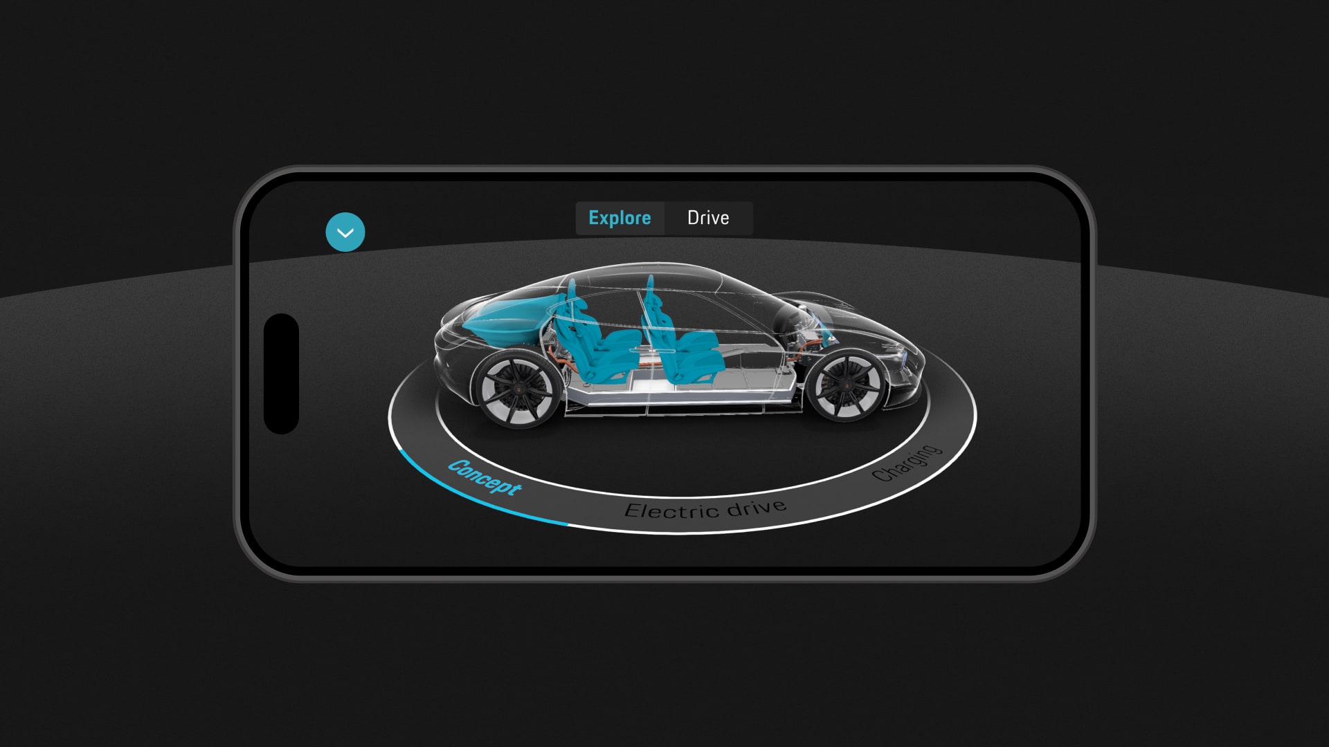
First we had to decide how to distribute the features. To better distribute the amount of features we decided to split them thematically into a 2D and 3D layer. We placed animations that take place directly on the car along a ring, on the ground. The intention was to have users move around the car to explore every detail. The design of the user interface was a hybrid of the design of the Mission E interface, as well as the Porsche digital design system. To make the car placement process as smooth as possible, we came up with animations to illustrate the user’s required movement sequences.
↗ Journey
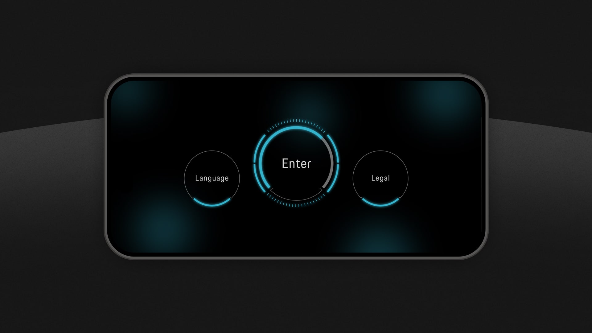
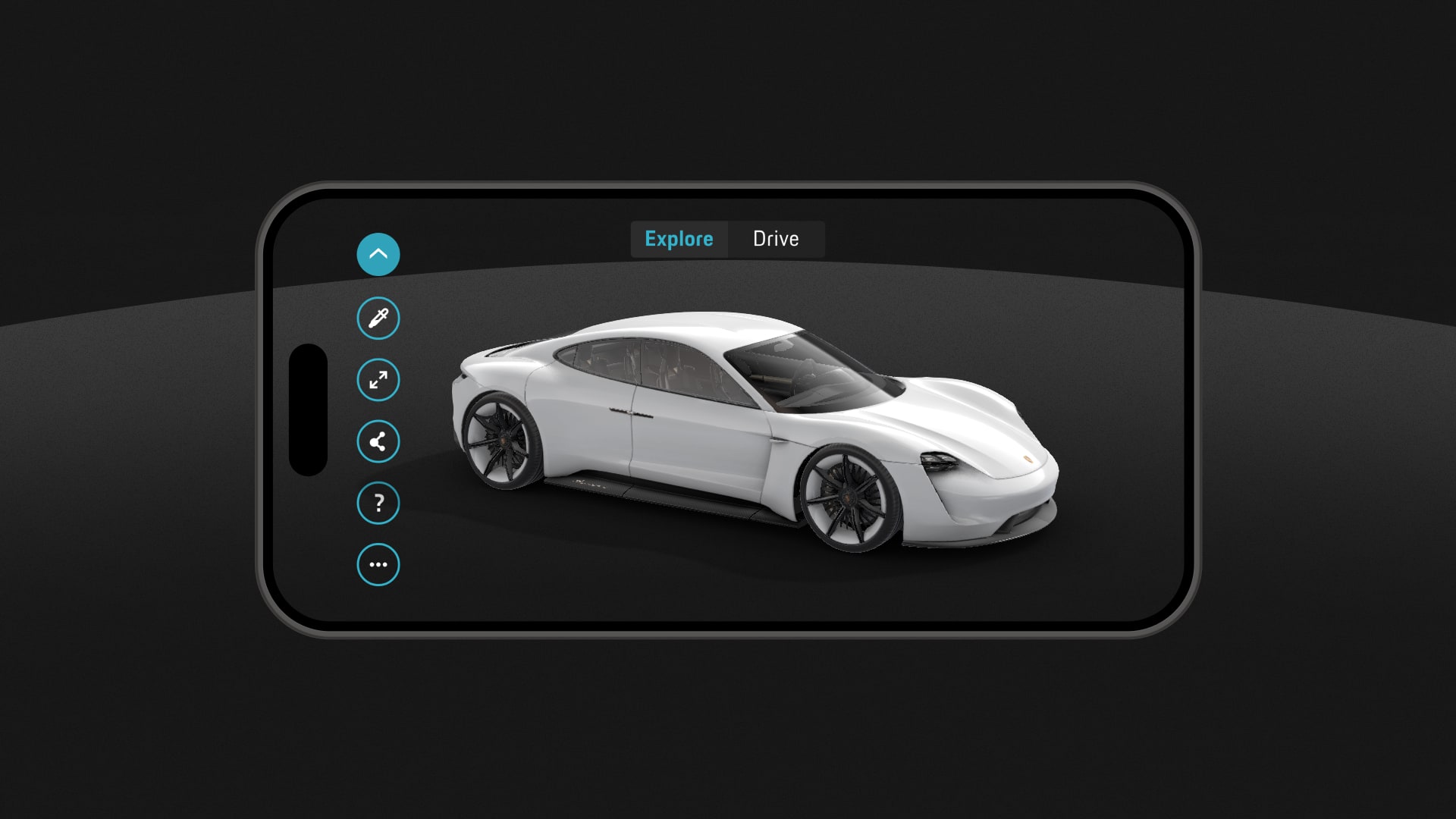
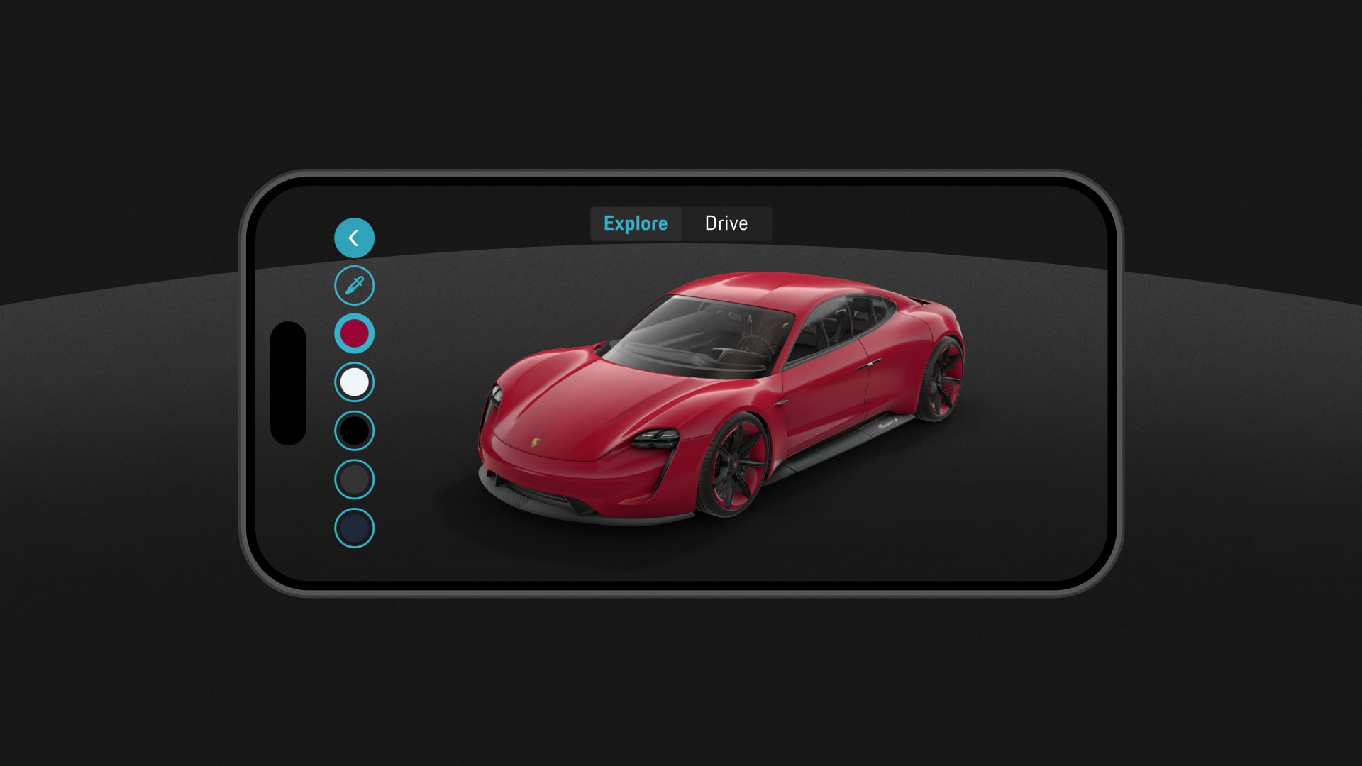
After entering the main menu, which is supposed to mimic the display inside the vehicle, the camera opens and the user is prompted to scan the environment. This allows us to place the car in the right perspective and create a more realistic effect. Now the user can move freely around the car and by selecting an item from the ring menu, it could trigger different animations that for example simulate the aerodynamics of the vehicle. In addition, the vehicle can be displayed in the desired color by selecting a pre-selected color or a color from the surroundings. Switching to “Drive” even enables a test drive of the car through the living room.
↗ Learnings
We learned that, especially in the early days of AR, it was necessary to guide the user as much as possible. The steps required, such as scanning correctly, are critical to an immersive experience and are still considered relatively unintuitive today. Therefore, we as a design team took a lot of time in implementing the animations and also supported the user with live feedback.
↗ Awards
Red Dot: Interface & User Experience Design
Red Dot: Spatial Communication Design
↗ Contribution
Concept, Art Direction, UX, UI
↗ Year
2019
↗ Company
svarmony